As competition is growing, so is the need to design an engaging and satisfying user experience. If you are someone who is looking for ideas to improve their UX and UI or simply wants to learn what UX and UI trends will be popular in the near future, stay tuned because, in this article, we will share 10 foolproof design tactics to improve your UX and UI in 2025.
Make Visuals Easy to Interpret
Making visuals easy to interpret should be a top priority for any designer looking to improve user experience and user interface. Let’s be honest, the attention span when scrolling through a website or an application is quite small and users expect to understand key information from graphics and visuals almost instantly. They favor experiences where they can efficiently find value.
So, designers must emphasize on visual communication to enhance comprehension and cut through the noise of useless information. Designers can accomplish this by;
- Drawing attention to important elements by making them larger, bolder, or placing them higher up.
- Complementing text with simple icons that symbolize key actions or concepts.
Additionally, designers should choose easy-to-decode visuals like colors, shapes, and placements based on what users are already familiar with. For example, red and green can signify stopping or going. By relying on cultural symbols and associations for visuals, user interactions can be made straightforward and hassle-free.
Users favor experiences where they can efficiently find value. Quick comprehension should serve as the main goal of your designs as it directly serves user needs and expectations in 2025.
Keep it Simple
With increasingly complex technologies and features at our disposal, designers may be tempted to provide extra information and options. However, users may find it overwhelming. The better choice here would be to keep interfaces clean and straightforward.
By eliminating unnecessary visual elements, users focus on the experience without distraction. In terms of functionality, limiting extra information prevents confusion. If the designers feel the need to push extra information or a new feature, it should have a clear purpose that should enhance the experience rather than just an addition to the list of features. If a feature adds cognitive workload without significant benefit, it might be a better idea to just exclude it.
Another way to “keep it simple” is to use plain language which is essential whether for UI text, terminology, or explanations. Designers should use concise writing in active voice with common words to make interactions efficient. jargon and technical concepts should be used only if absolutely required for the target audience.
Design with End User in Mind
When designing any product in 2025, designers should not forget to keep the end user at the forefront. Understanding who your target customers are and how they use the product can provide you with valuable information to create positive user experiences.
Here is how you can do so;
- Start by assembling user personas that capture essential details about real-life groups who will utilize your product.
- Include relevant demographic and psychographic qualities as well as their goals. Evaluate existing solutions to identify shortcomings that your designs can improve upon.
- Conduct user testing early in the process to gain firsthand insights about usability needs.
- Continually check in with user groups through development cycles for feedback to refine the product.

Before adding any complex feature, question whether it offers value or not. Does it justify a potential learning curve or not? When end users are involved and empowered throughout the design process, you guarantee satisfaction.
Use White Space
Cluttered pages that cram in too many elements can feel visually overwhelming. It is fatiguing to the eye and the users simply don’t like it. This is why designers should employ white spaces where they can. The use of white space draws the eyes to where users should be focusing. In other words, it lets the context on screen breathe.
At the same time, too much white space may appear boring, but subtle background textures can add aesthetic appeal, but resist overloading the visual field just to avoid empty areas.
Clean designs not only look professional for modern aesthetics but also improve usability and comprehension. White space reduces noise so core interface components get the attention they deserve.
Don’t Forget The Search Box
While new features are important, don’t overlook the importance of a simple yet powerful search box. No matter how intuitive a UI or beautifully designed a site is, users will likely need to hunt for specific content at times. Placing an effective search box offers them the freedom to find relevant pages quickly.
The search box is crucial since its absence can become a hindrance to a smooth experience. Users might find it annoying and stressful to navigate through all the useless information to land on a page they want.
Adapt to Trends
Staying on top of design trends and adapting quickly is a reliable tactic for designers to improve user experience and user interfaces. With the fast pace of technological innovation, design trends come and go rapidly.
For example, as mobile technology continues to advance, trends like increased use of gesture controls, voice commands, and augmented reality reflect user desires for immersive experiences. Designers adopting these trends early on can lead the way in enhancing UX on mobile devices. Additionally, trends toward minimalism such as increased white space, and flat design promote visual clarity and ease of use.
Visualize Data
Thoughtfully crafted data visualizations promote comprehension and draw valuable insights from complex information. For instance, dashboards showing volumes of business analytics empower managers to monitor KPIs and metrics at a glance via charts and graphs rather than raw numbers alone.
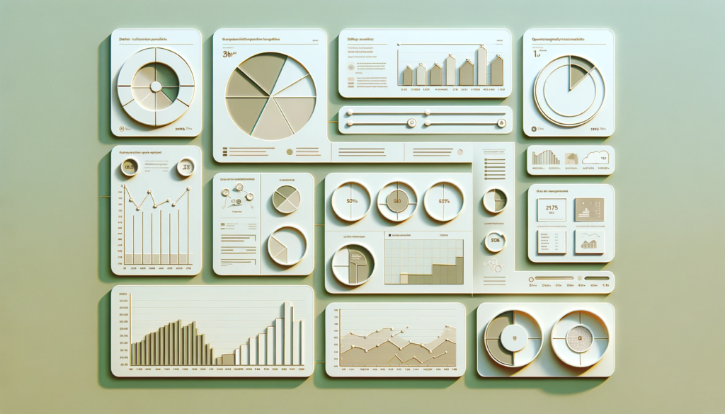
Similarly, visualizing website analytics through heatmaps illustrates precise on-page areas users interact with, highlighting improvement opportunities.
Designers can use the following types of formats based on data types and use them for visualization;
- Bar Graphs
- Pie Chart,
- Histogram,
- Tree Maps
Make Room for Personalization
Allowing users to tailor experiences to their personal preferences is an excellent way for designers to enhance usability and modernize interfaces. As customer expectations shift towards individualization, designers embracing user-focused personalization stand to gain a competitive edge.
Why should designers make room for personalization?
- From an aesthetic standpoint, personalization through alternative layouts, color schemes, and icon styles enables unique self-expression and diverse representation. This elevates inclusivity in digital spaces, strengthening UX and UI foundations.
- Functionally speaking, custom configurations including dashboard arrangements and notification settings put control directly in users’ hands giving them more liberty over their interaction with the product.
How can designers make room for personalization?
- By planning personalized features in the design stage, designers can create unique experiences for users. This approach allows for customization within the brand’s rules, keeping the interface interesting and user-friendly.
- Designers can make room for personalization by allowing users to customize elements like content, notifications, and themes to meet various user needs. While this means giving users some control over the design, creating a flexible system leads to a more adaptable user interface that evolves with its users.
Ensure Cross-Platform Compatibility
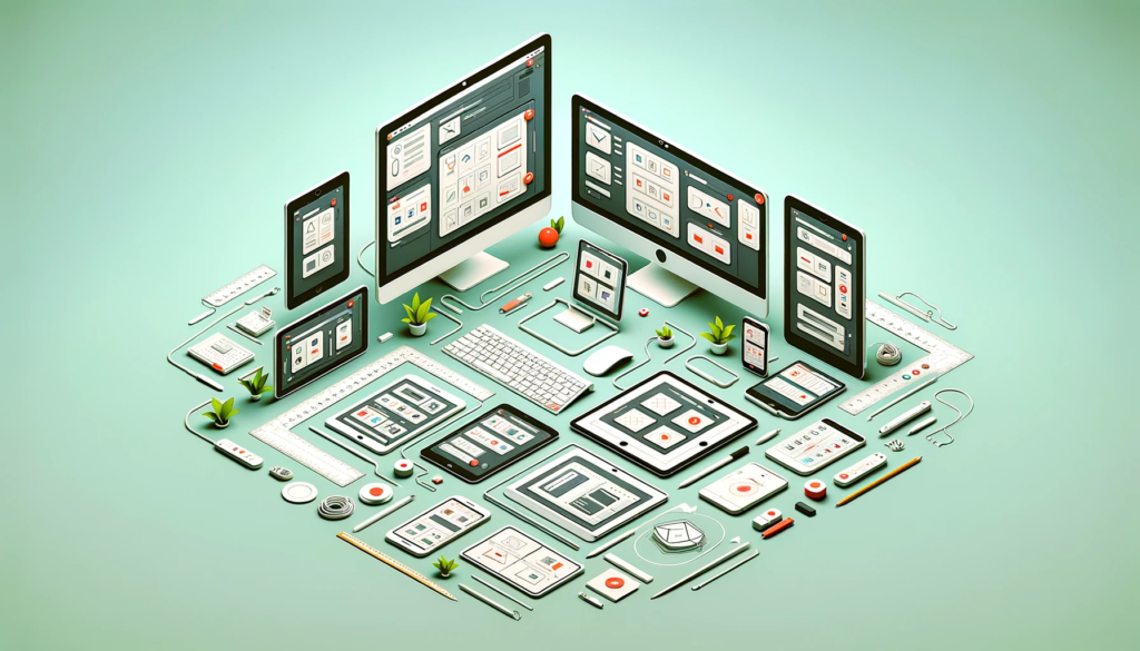
Designing for cross-compatibility is essential as users access content on various devices and platforms. Therefore it’s important for designers to consider cross-platform compatibility. This means creating interfaces that work well on different screen sizes, input methods, and resolutions.
From the start, designers should focus on building a foundation that works across platforms. This involves planning and testing designs on different devices, using tools like wireframes and emulators. This approach helps create a user experience and interface that remains effective and appealing across different platforms.
Ask for Feedback and Act On It
Actively seeking user feedback and responding with impactful changes is an excellent way for designers to improve UX and UI. Through feedback, designers gain crucial insights into improvement opportunities from those who ultimately determine the success of the product.
Whether through surveys or built-in analytics, collecting data allows for future improvements. For example, Questionnaires around new redesigns can indicate which features to double down on and which need rethinking.
How do designers act on feedback?
- Designers use feedback from real users to identify where the design doesn’t meet expectations. They focus on specific parts of the interface that need improvement, creating a plan for change.
- By working together with other teams and focusing on user needs, designers make effective changes. These changes, whether small or big are based on user feedback to ensure they meet real needs.
This process of continuously collecting user feedback, identifying problems, and improving the UX/UI helps align the design with what users think and want. By being curious, listening carefully, and acting on feedback, designers can create experiences that users love and that achieve desired results.
Conclusion
There are several techniques as listed above that designers can use to improve their UI and UX experience. At the very core of it lies optimizing visuals for easy interpretation, personalization, and an eye out for trends. But regardless of what technique you employ, always keep the end user in mind and act on feedback.

