
Even as digital experiences continue to evolve, many B2B companies are still making critical mistakes in how they present themselves online. A well-designed website isn’t just about aesthetics; it’s about trust, usability, and conversions. Many B2B companies still struggle with basic B2B web design mistakes even in 2025. From confusing navigation to weak calls to action, small design flaws can lead to lost leads and poor performance. In this article, we’ll look at the most common issues and share simple, effective ways to fix them.
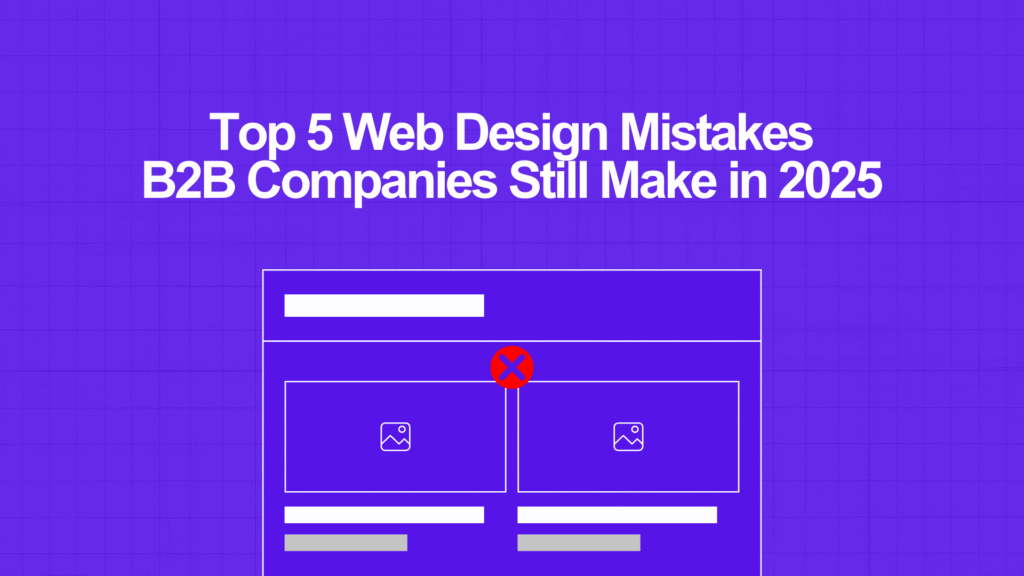
1. B2B Web Design Mistake #1: Overloaded Homepages
One of the most common issues in modern B2B web design is a homepage that tries to do too much. Instead of communicating one clear message, it presents layers of content, jargon, and competing calls to action.
B2B buyers don’t want to decode your value proposition. They want clarity fast.
Web Design Tip:
Craft a headline that clearly communicates who you serve and what problem you solve. Support it with a subheading and a single, primary call-to-action. Keep the design clean and allow the message to lead.
2. B2B Web Design Mistake #2: Ineffective Navigation and Information Architecture
Website navigation is often overlooked, but it plays a critical role in B2B user experience. A confusing menu with too many options or vague labels increases bounce rates and decreases conversions.
When buyers are looking for solutions, they expect an intuitive, structured path that gets them where they need to go quickly.
Web Design Tip:
Limit your top menu to 5–6 key items. Use clear, direct language (e.g., “Pricing,” “Solutions,” “Contact”). Make high-value actions like “Request a Demo”, easy to find and consistent throughout your site.
3. B2B Web Design Mistake #3: Neglecting Mobile Optimization
It’s no longer just a consumer issue; more than half of B2B buyers now research and interact with vendors on mobile devices. Unfortunately, many B2B websites still aren’t fully optimized for smaller screens.
This leads to poor readability, broken layouts, and hard-to-tap buttons, which all create friction.
Web Design Tip:
Run your site through a mobile test and review the mobile version manually. Make sure fonts are readable, buttons are well-spaced, and menus function properly. Prioritize performance and usability for all screen sizes.
4. B2B Web Design Mistake #4: Lack of Credibility Through Social Proof
Even in B2B, purchasing decisions are emotionally driven. If your website lacks trust signals such as testimonials, client logos, or case studies, it becomes harder for visitors to feel confident in taking the next step.
A well-executed B2B web design strategy should include real proof that your product or service delivers results.
Web Design Tip:
Add testimonial quotes, recognizable client logos, or brief case study highlights on your homepage and service pages. Create a dedicated “Success Stories” section where prospects can explore real-world results in detail.
5. B2B Web Design Mistake #5: Weak or Missing Calls to Action
A beautiful website with no direction is like a sales team with no pitch. Many B2B websites either bury their CTAs or use generic phrases like “Learn More” that don’t inspire action.
Every page should have a clear purpose and guide the user toward it.
Web Design Tip:
Use action-driven CTAs that match user intent. Phrases like “Schedule a Consultation,” “Get a Free Audit,” or “View Pricing” are much more effective. Place CTAs strategically throughout the page, not just at the bottom.
Conclusion
Strong B2B web design isn’t about flashy visuals. It’s about clarity, usability, and building trust.
By avoiding these five mistakes: cluttered homepages, confusing navigation, poor mobile UX, lack of social proof, and weak CTAs, you can dramatically improve your site’s ability to attract and convert high-value leads.
Whether you’re planning a redesign or optimizing your current site, these web design tips will help you stay competitive in 2025 and beyond.
Need Help Improving Your B2B Website?
At Bilzimo, we help B2B and SaaS companies create websites that are clear, fast, and built for growth. From user experience audits to full redesigns, we focus on strategy, not just style.